Tree-Views
Available via:
This kind of view is made for showing data that is hierarchical. Items support:
- Custom layouts
- Renaming
- Activating
- Custom drag & drop controllers
- Custom context menus
- Collapsing parent items
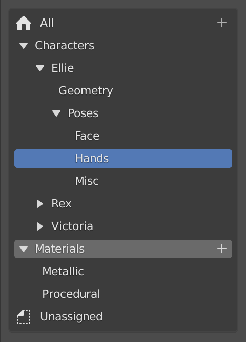
Building tree UIs becomes much simpler as the UI code does a lot of the heavy lifting. The tree is built by first defining a number of items and child items, then each visible item is built into a row layout.
Creating a Tree-View
Defining a new tree can be done as simple as this:
class MyTreeView : public ui::AbstractTreeView {
  void build_tree() override
  {
    ui::BasicTreeViewItem& item = add_tree_item<ui::BasicTreeViewItem>(IFACE_("Some Item"), ICON_HOME);
    /* Child item. */
    item.add_tree_item<ui::BasicTreeViewItem>(IFACE_("Child Item"), ICON_CON_CHILDOF);

    add_tree_item<ui::BasicTreeViewItem>(IFACE_("Item without icon"));
  }
};
Each item added to the tree will be displayed as a row (if it is
visible), nested under its parent. Parent items are collapsible. In the
example above, the items are of type ui::BasicTreeViewItem, which is
a predefined item type for simple tree rows. Each row only contains an
icon and a label.
For more control over what goes into a row, custom item types can be
defined in a similar fashion:
class MyTreeViewItem : public ui::AbstractTreeViewItem {
  void build_row(uiLayout& row) override
  {
    /* ... Regular UI layout code ... */
  }
};
Different item types can be mixed in a tree.
Lastly, the actual instance of the tree-view can be created for a
uiBlock:
ui::AbstractTreeView *tree_view = UI_block_add_view(
    block,
    "My tree View",
    std::make_unique<MyTreeView>());

ui::TreeViewBuilder builder(*block);
builder.build_tree_view(*tree_view);
For a more complex real-life example, check the asset catalog tree-view code: https://projects.blender.org/blender/blender/src/branch/main/source/blender/editors/space_file/asset_catalog_tree_view.cc
Design Notes
- Every row has a tree-row button (
UI_BTYPE_TREEROW). An overlapping layout is used to place it underneath the customizable row layout of each item.
Customizing
BasicTreeViewItem: Custom Activation Behavior
To not have to create a sub-class of ui::BasicTreeViewItem just to
customize its activation behavior, it offers a different way to set the
custom behavior:
ui::BasicTreeViewItem& item = add_tree_item<ui::BasicTreeViewItem>(IFACE_("All"), ICON_HOME);

/* Pass activation behavior as lambda, function object or plain old function pointer. */
item.on_activate([](ui::BasicTreeViewItem &item) {
  std::cout << "I've been activated!" << std::endl;
});
Improvements/To-Do's
For general view system To-Do's, see T98560.
- Support reordering or changing the hierarchy via drag & drop (the generic parts of it, like finding and visualizing the item to insert into/before/after, drop polls, reinsert callbacks, etc.)
- Avoid \(O(n^2)\) complexity of state reconstruction, more precisely
AbstractTreeView::update_children_from_old_recursive(). - Draw hierarchy lines.