From BlenderWiki
An Introduction to Color Management in Blender
There is much confusion around color management. This document aims to clarify some of the reasons it is exceptionally important and how it pertains specifically to Blender.
If you are already up to speed with the why, what, and how of color management and want to understand how to implement display calibration and profiling in Blender, proceed to the calibration and profiling section.
Q: I have a Question!
Please add your question to this document in this section.
Q: Why are you bothering to re-iterate all of this color management mumbo jumbo? Why are you reinventing the wheel you donkey?
Color management is traditionally associated with the graphics arts and digital printing pipelines. It is so prevalent that it is often erroneously considered the sole means to a color managed system.
This is obviously an incorrect assumption, and some color management workflows offer a greater degree of flexibility and power as dictated by the needs of particular artists.
To this end, this document attempts to dissect color management down to a lower level to achieve a greater degree of understanding of the concepts involved. This lower level will serve an artist well when dealing with motion picture, visual effects, and animation pipelines that require color management with needs that extend beyond the traditional ICC based workflows.
Q: What is color?
From the CIE's International Lighting Vocabulary:
CIE International Lighting Vocabulary
Attribute of visual perception consisting of any combination of chromatic and achromatic content. This attribute can be described by chromatic color names such as yellow, orange, brown, red, pink, green, blue, purple, etc., or by achromatic color names such as white, gray, black, etc., and qualified by bright, dim, light, dark, etc., or by combinations of such names.
Note |
Of particular importance is the note given above. Ultimately, perceptual color is a relative experience, subject to a number of contextual circumstances.
Q: What is color management?
The question should actually be "How can I create images that someone else can view across various media the way I intended them?"
Color management is a process that provides mechanisms that deliver to the relative nature of human vision. It should be seen as no singular aspect, but rather an entire approach that spans hardware, software, and education.
Q: Why is color management important?
Without color management, you have no clue what you are looking at. Yes, it's that important. Again, the human eye is an adaptive sensor that constantly adjusts to context.
Q: How is color perceptually relative?
The following illusions should illustrate precisely how relative your perception is. It should be easier to comprehend how ambient viewing conditions, relative colors, and white point, will influence your perception of color and why color management must be used. Web browser color management will have little effect on the overall impact of the illusory phenomenon.


Q: Why is color perceptually relative?
While a massive question, the result is explained by the fact that the human perception system is adaptive. This means that over time, the rods and cones in your eyes will fatigue and adjust to a given range of light.
To visualize how your eye will adjust to color, try the following example. Web browser color management will have little effect on the impact of this phenomenon.

Q: Is there a description of the above effects? Have researchers examined how we perceive color?
Yes.
The bulk of the complexities around color come from the issue of color appearance phenomena. The following examples are provided for further research:
- Bezold-Brücke Hue Shift
- Abney Effect
- Helmholtz-Kohlrausch Effect
- Hunt Effect
- Simultaneous Contrast
- Crispening
- Helson-Judd Effect
- Stevens Effect
- Bartleson-Breneman Equations
- Chromatic Adaptation
- Color Constancy
- Memory Color
- Object Recognition
Q: Does a color management system deal with all of the complexities surrounding color?
No. Nor should it.
There are many instances where the context dictates the needs. Perhaps you wish to evaluate the raw data of an image for processing. In this instance, performing color transformation might introduce channel crosstalk and other unintended results.
An artist should assume that no single color management system will account for all possible contextual needs.
Q: I have a $10000 monitor, should I care about color management?
Yes. In addition to the simple fact that your monitor ages and the way it responds to signals changes over time, there is a tremendous deal more to color management than the accuracy of a piece of hardware.
Q: Do I need a hardware calibration thingy?
Yes. Hardware ages, color spaces have different targets, and other variables such as ambient viewing conditions must be taken into account. Inconsistencies across hardware can also create a need for a hardware device. For example, while many generic monitors are labeled as meeting the sRGB specification, it is rare that they come close. The only way for an artist to maintain any degree of control and assurance is to evaluate a particular device on a case by case basis. This evaluation requires some form of hardware color evaluating device.
Finally, it is impossible to generate a display profile without a hardware color device. Such a profile is required in a color management system.
A Word of Warning
All colorimeters and spectrophotometers are not alike. Colorimeters require carefully crafted filters to behave correctly for a given typical display. If you happen to have a wide gamut monitor, the filters may not be calibrated for such a device and yield strange and inaccurate results. Make sure your measurement device is suited for your display device.
|
Q: I have a $10000 monitor though, do I really need to care?
Yes. Again, your hardware will age. The chances are that the more expensive monitors will be extremely consistent across the screen and ship with default calibration that may be close to a given standard, but that will not hold up across time. Accuracy of color drifts over time, and the need for known color space calibration and profiling require vigilant attention to color management.
Finally, the $10000 monitor will not help you deal with the specifics of the larger goal of transforming between color spaces. This is the domain of color management.
Try a $10000 monitor with the following simple JPEG without color management. Does it work? Despite being identical RGB values, the creative intent of the piece is radically different given a correct color transform versus none.
Even if you are using a color managed browser, the chances that the reference colors match the actual intended colors is low. Why? Because unless the response profile of your display is hooked into the overall system, the colors are not able to be transformed correctly. A good example would be when viewing on a wide gamut display. If the display's response isn't taken into account, the sRGB values are fed directly to the display. The result? Heavily over-saturated colors compared to the intended look.

A $100.00 to $200.00 investment is a small percentage of the investment of a $10000 display. A hardware colorimeter or spectrophotometer should be viewed as a mandatory pipeline element to any artist delivering content.
Q: Is there anything else I need to care about with regards to color management?
Yes. If you have ever heard the phrases "It looks too orange!" or "It looks too dark!", you are well aware that color and value perception is a complex beast. Color management systems handle the software side of conversions, but there is a physical side as well. Your viewing environment should also match the specifications set forth by the standards. This includes a general brightness level and a white point of your environment.
Q: What are color primaries?
Color primaries dictate both "How red is red" and "What red is red?" in terms of overall saturation of the pure channel colors. They are commonly a reference to the CIExyY or CIE XYZ color space models that define where each primary rests on each respective absolute scale. When you wonder what color the red, green, or blue axis in Blender's RGB means, this is a method of defining it in a properly color managed system.
Of particular note is that the phosphors in your display are limited in the range of chromaticity values it can output. This is critical to the understanding of a display transformation from a given color space.

Q: What is a gamut?
A gamut traditionally refers to the volume of color a particular color model / space can cover. In many instances, it is often illustrated via a 2D model using CIE Yxy coordinates.
Q: Does a 2D color gamut shape provide enough information to evaluate a gamut?
Absolutely not. Remember that a color gamut is a 3D volume. Likely familiar to a 3D artist, a 2D representation does not inform one of the 3D nature of volumes and dimensions.
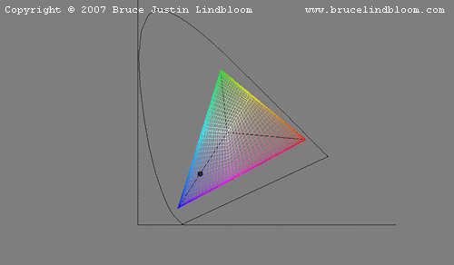
In the case of a 2D gamut diagram, what is missing is the information of the dimensions of a gamut as it moves toward reference black or white. The following image is a direct link from Bruce Lindbloom's fantastic explanation of 3D gamut volume. Note how the three points appear within the sRGB 2D gamut diagram but are, in fact, outside of it.
Always remember color is a volume!

Q: What is gamut mapping?
Gamut mapping is the method of transforming one particular color gamut into another, typically smaller, gamut. Gamut mapping can have different intentions behind them.
Much of gamut mapping leverages many of the principles surrounding color appearance phenomena.
Q: What is a white point?
A white point is a measurement of what color white your mind will perceive as being without color, or achromatic. Often this measurement is given on a Kelvin scale. Daylight for example, can read around 6000k or above. Tungsten based light reads around 3200k. The standards D65, D60, D55 etc. correspond to a 6500k, 6000k, and 5500k measurement.
In a traditional 2D gamut diagram such as the CIExyY image above, the white point dictates the center of the gamut where, when equal channels of RGB are combined, an achromatic sensation is created. In the above diagram, one can see how the white point arc defines how each white point affects the center of the triangle and how each color would transform as it travels toward white. It should again be highlighted that color is a 3D volume, and one cannot communicate color effectively using a simple 2D diagram.
Take note that the perception of color is extraordinarily complex and that the sensation of color or lack thereof is buried under layers of said complexity. The sensation and consistency of image perception is not purely a matter of matching wavelengths, even if it were possible.
Q: What does the white point of my environment have to do with my darn monitor!?
Your eye will adjust to a given environmental white point. Everything an artist views will be in relationship to the white point, which becomes achromatic. If your eye adjusts to 6500k (D65), lower temperature light will appear with a tungsten orange cast. Conversely, an environment that is tungsten balanced will result in the artist perceiving higher Kelvin with a blue cast. White point settings will have a permanent impact on creative output if not considered.
A better way to explain perceptual adjustment is via images. Web browser color management will have little effect on the impact of this phenomenon.

Consider that the ambient light around you is influencing your perception of color. Now consider that your monitor also has a given cast of color. Now try to imagine how complex your perception of color is and, at the same time, how to communicate color to someone else or some other element in your pipeline.
Q: I see. If the color of my ambient environment matters, then the overall light level intensity will too, correct?
Yes. Which is why color spaces have defined brightness levels for viewing which are considered in conjunction with the space's curvature.
If you go to a theatre to watch a movie, chances are that it will be dark. This impacts the overall level of the shadows to whites. As you may have guessed by now, there is a digital standard aimed at that environment that defines viewing conditions, color primaries, and other such details[1].
Again, the human eye's perception of value is a complex series of learned firings in your brain. To highlight the added complexity that years of visual training and learning play in your visual system, examine the following:

Q: I'm using Blender! Why the heck should I care?
Ultimately there are many variables and an artist cannot control precisely how an audience member views their creative output. That said, by eliminating as many variables as possible you can more greatly control how accurately the creative intent of your work is perceived across a vast range of devices and output.
Further, if you are using Blender in an environment where you must communicate color and work to others, color management becomes mandatory. Everything from processing work to a Digital Betacam tape, a BluRay disk, a YouTube upload, a picture on Picasa, to a printout at your local photo lab will depend heavily on an awareness of color management.
Color management is becoming more ubiquitous, with common applicatons such as web browser and video players now taking care to more accurately display work. With this in mind, color management and color aware pipelines become ever more important.
Q: What are some situations that make color management useful?
While color management is effectively useful across all situations, some situations make it more critical than others. Some examples might be as follows:
- Ian is trying to communicate a look to an artist on another workstation.
- Ton is trying to get the team's footage properly converted for a DVD, BluRay, and YouTube.
- Francesco is trying to get the footage prepared for a screening on a digital projector.
- Sebastian is trying to grade some of the visual effects elements to match other elements.
- Brecht is converting files out of the F65 for use by the team.
- Andy is preparing footage for the team's viewing on the studio broadcast monitor.
- Jeremy is finalizing a large format poster for the Blender Foundation's wall.
All of the above scenarios involve color management to assure that the process is as painless and accurate as possible.
Q: What are the Basics of Color Management?
In the simplest possible sense, color is represented as a model. There are many models such as RGB, YCbCr, CMYK, CIE LAB, CIE XYZ, etc. used to model color. Within each model system, there are also ranges of color, or gamuts, that can be described.
Color management focuses on dealing with transforming between models, or defined color spaces within certain models. In particular, this document focuses on dealing with Blender's internal RGB model and how to deal with color spaces surrounding that model.
Q: Is there a Simple Workflow Description?
If we consider that we loosely have three phases to all operations, a simple workflow can be outlined.
Input Space
This is the color model / space of the source material. Common graphic art spaces might be AdobeRGB, ProPhoto, or sRGB. Motion picture cameras might offer LogC, SLog, PanaLog, ViperLog, etc.
Working Space
This is the space that the input is "poured" into. This is the space that all manipulations happen in. If the working space is too small in bit depth or color primaries, input data might be clipped and lost, or subject to degradation due to rounding errors during consecutive manipulations.
Output Space
This can be several spaces depending on complexity. A simple chain might consist of an input space, a working space, and an output space such as a display. Other outputs are possible, including printers, digital projectors, or unique industry oriented spaces.
Q: I thought RGB was a color space! I'm confused!
RGB is not a color space per se, but rather a method to model color. In most applications, the RGB values are implied to be sRGB. sRGB is a standardized color space.
As you can expect with a well defined color space, sRGB comes with details of color gamut, white point, and assumed viewing environment details[2].
Q: I bought a hardware colorimeter or spectrophotometer. I installed the software and clicked a button. I am in a color managed pipeline right?
Wrong. Color management requires three pillars to be effective. If at any point in a process one of the pillars is failing, the entire system will fail.

Q: Does Blender offer a Color Managed Pipeline?
As of revision 50628, Blender now has the foundation to enable a color managed pipeline through the OpenColorIO library. This can be harnessed by an artist to embrace a fully color aware system.
Remember, color management extends beyond software into hardware and education. Having the software and hardware ability to color manage a pipeline is meaningless if it is established erroneously or without proper process.
Q: Does OpenColorIO make Blender color aware?
The short answer is no. The animation and visual effects industries orient around a differing set of needs than the graphics arts industry and as such, different approaches are needed.
To this end, ICC profile pipelines are not included. This means that an artist must be acutely aware of asset ingestion and export. If an artist assumes that magic will happen via ICC profiles, they are sorely mistaken, and this likely accounts for the vast amount of misinformation and poor implementation of color managed pipelines.
If you take the time to learn a little bit about color management and process, you should be able to function in either environment well. Education will also provide for the ability to spot issues and solve them.
Q: I have a question!
Please place all questions in this chapter. They will be added to the above list. Pose your question in the following format for easy editing.
Q: Here is my sample question?
This is a sample question. Use four tildes '~' in a row to sign your question please. Sobotka 21:00, 17 June 2012 (CEST)
